Are the Planets Inhabited? Magazine Layout
You may also like

2025
Pasta Amore

2025
Eau de Fin
2025
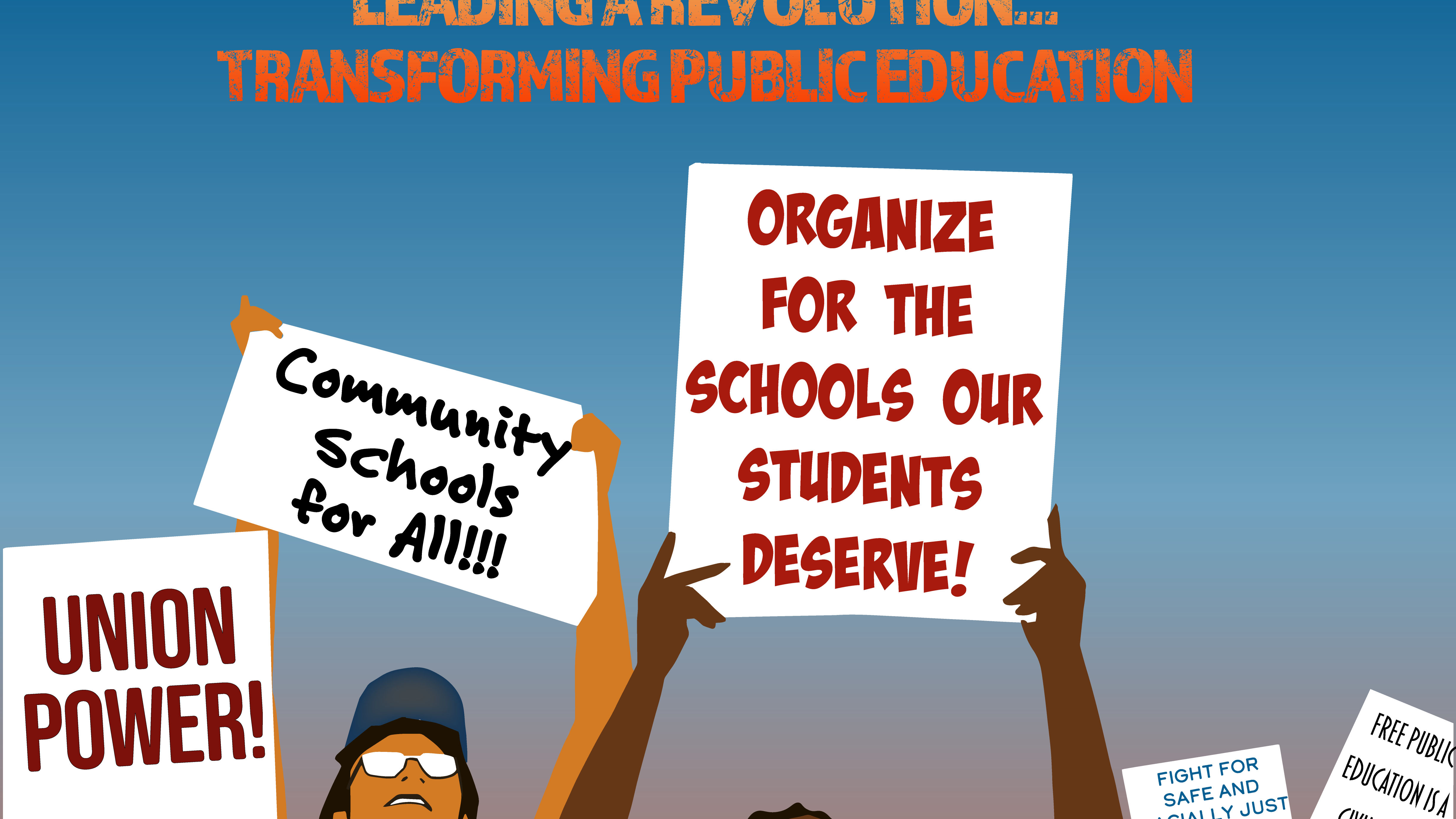
2023 CTA RILC Program Covers and Social Media Posts

2025
MontraPae Backpacks Online Advertisements
2025
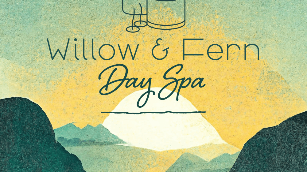
Willow & Fern Day Spa

2025
Vivid Glow Proposal
2025
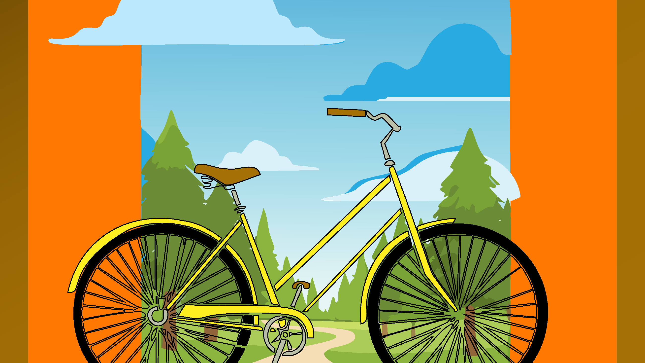
Felps Bicycles Poster/Social Media Post
2025
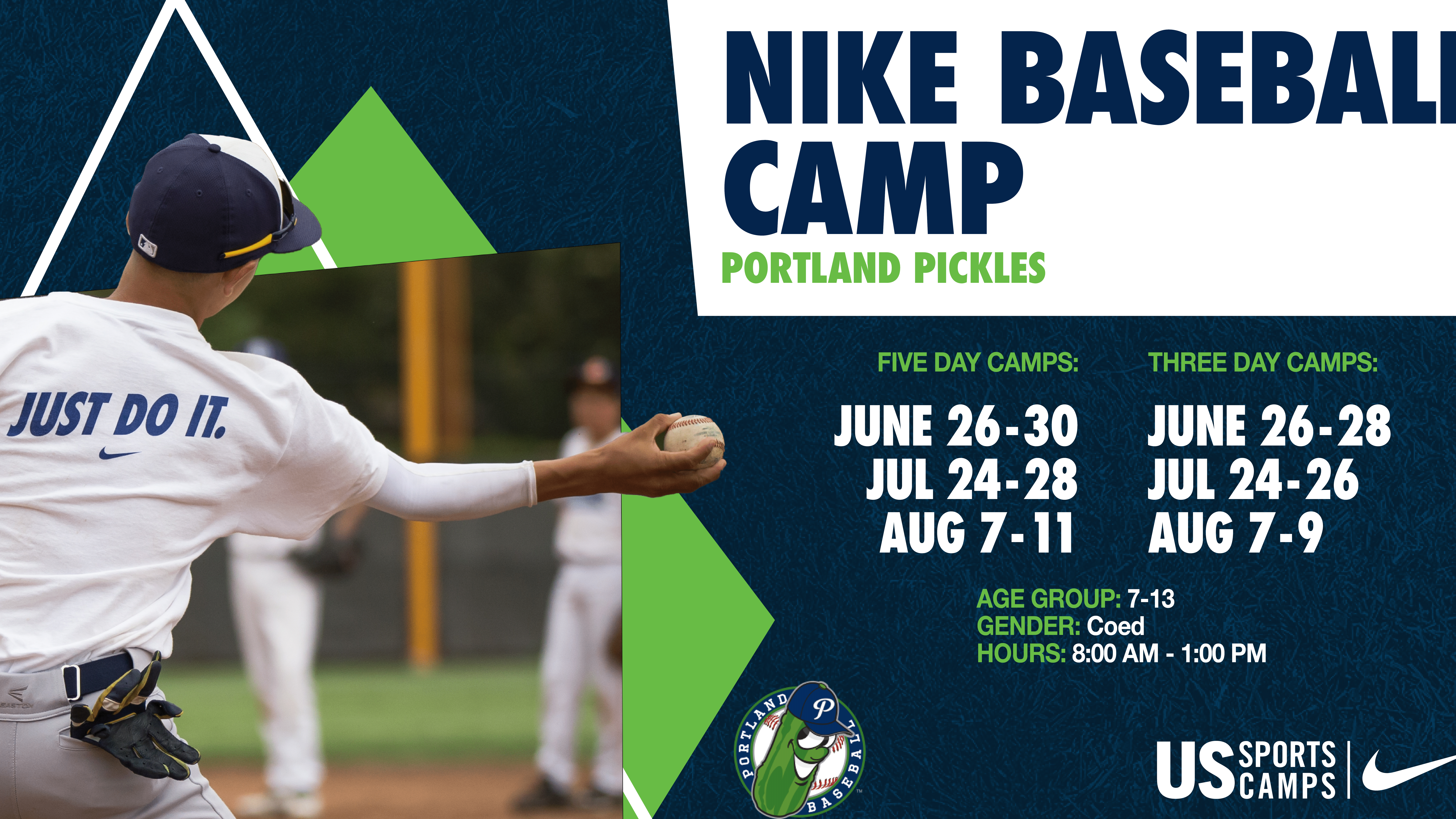
US Nike Sports Camps - Baseball
2021
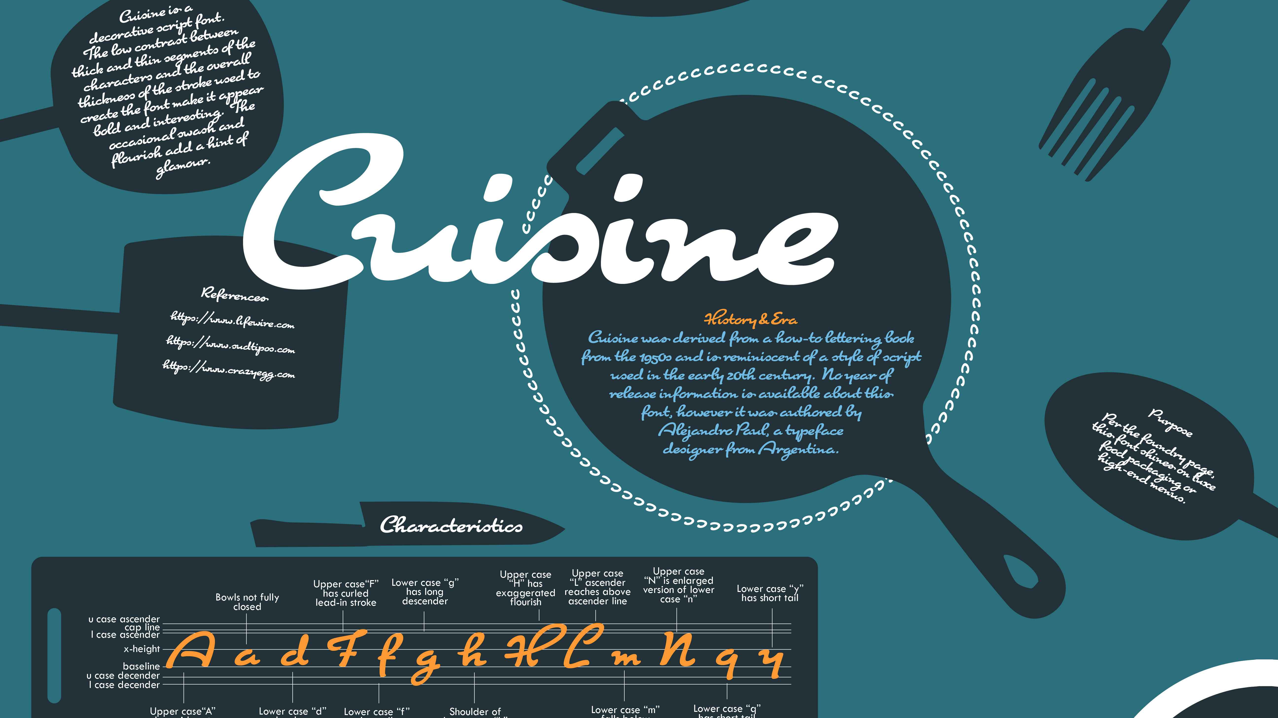
Homage to a Font - Cuisine
2025
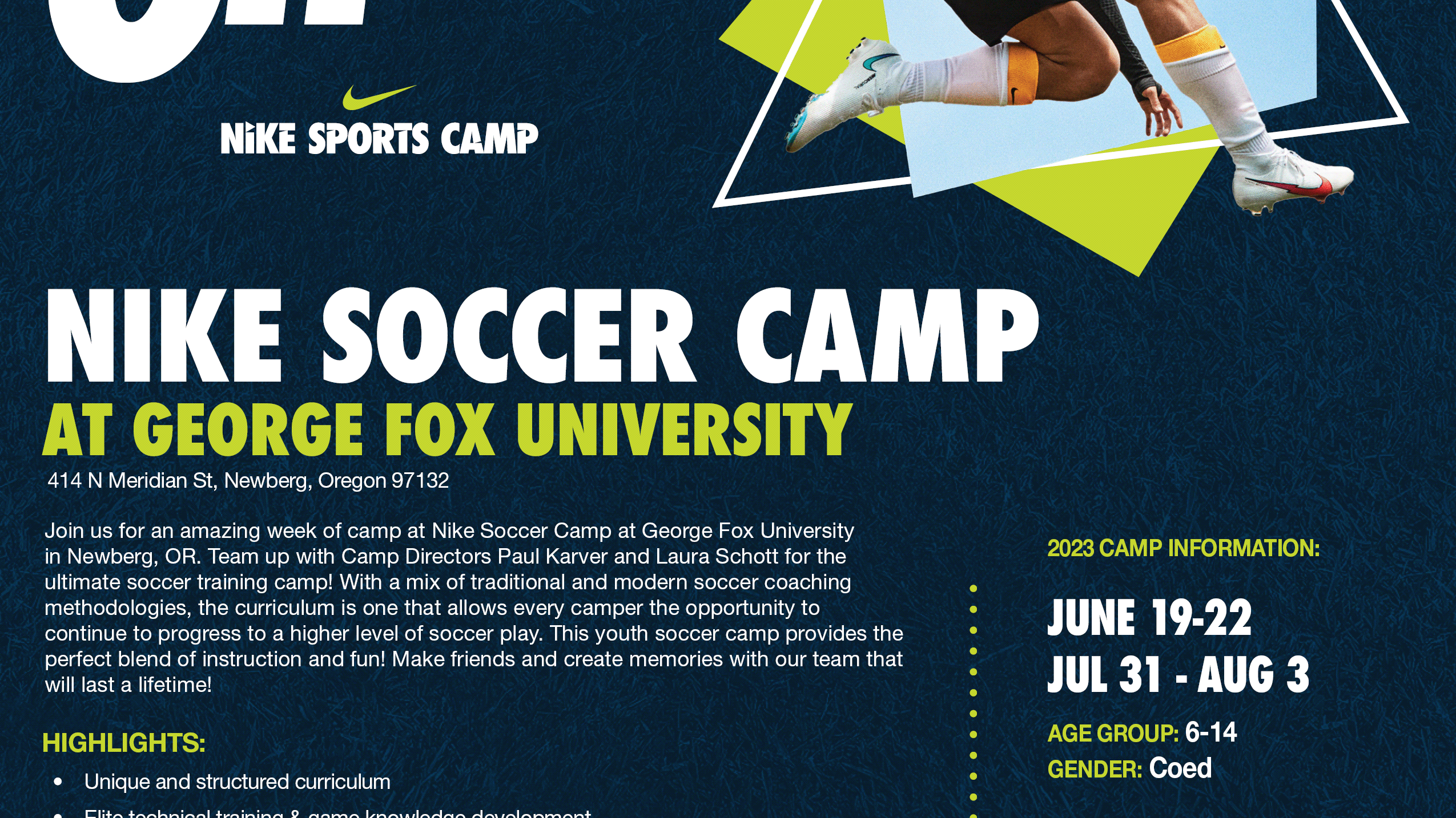
US Nike Sports Camps - Soccer
